
Art has been, and still is very subjective. It can encapsulate any and all human activities that are symbolic, conceptual, expressive or just technical. Geography and culture further compounds its complexity. It’s no wonder the definition of what constitutes Art is disputed[1][2][3] and has changed over time. This identity for MEAT attempts to bring a new lens on Art and the Middle East, encouraging people to bring an open mind to its meaning; because there always is.
ClientIndependent art curator launching a new galleryScopeIdentity Design.TeamManoj Kurian Kallupurackal, Sagar Ghoting.Duration8 Weeks.
The Design
We helped MEAT present a new perspective on art, and on the Middle East. It allows works of art to be seen in new ways, and to have new effects on the gallery visitor. Any way you choose to look at it, however, MEAT is trustworthy, authentic, and knowledgeable.
This logo is a rotational ambigram, meaning that it is the same whether it is viewed right-side-up or upside-down. Not only does this provide an interesting visual language for future campaigns, but it also has metaphorical meanings that we think will add value to the MEAT brand, and start the gallery off on a strong heading.
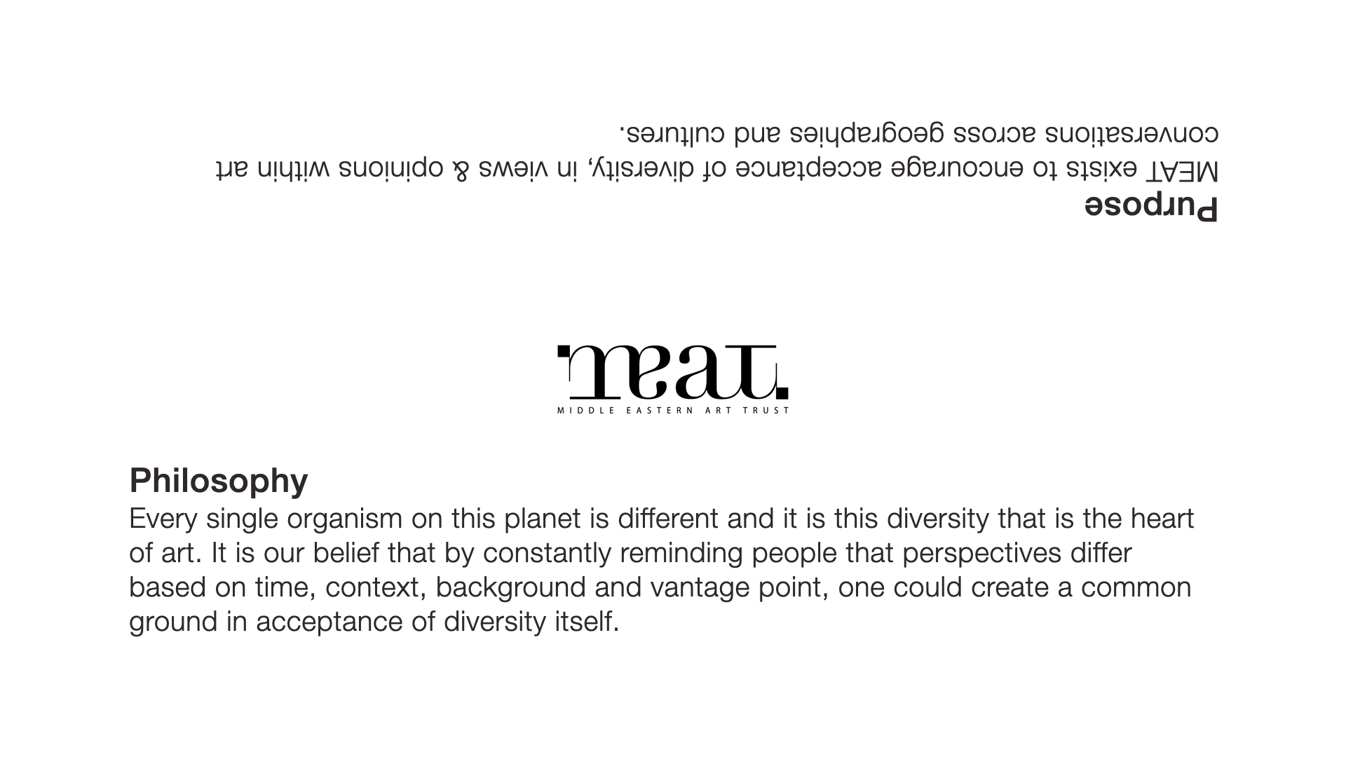
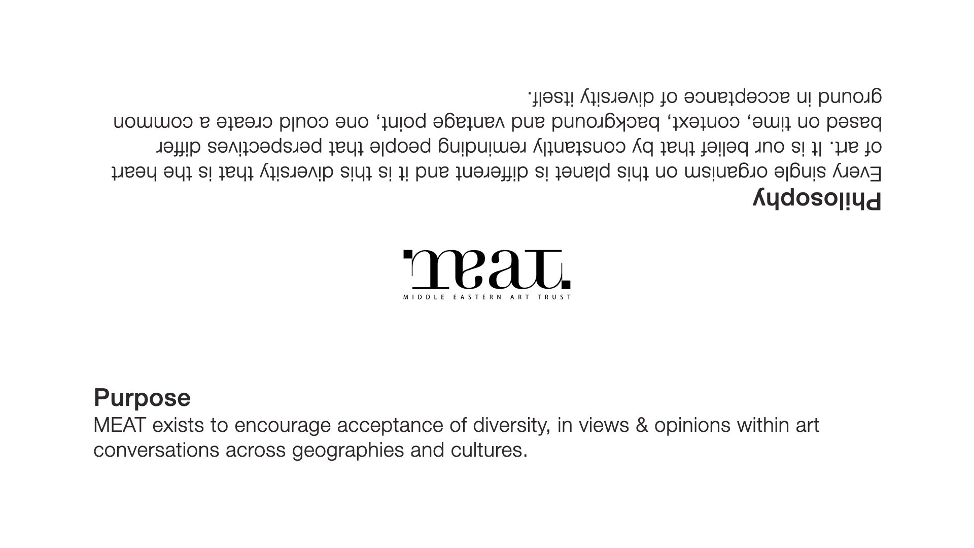
The gallery is hoping to be a starting point for conversations between different cultures, particularly between the West and the Middle East. When cultures come together in any sense, both sides are often left feeling that the other side is somehow “backwards” or “upside-down.”
The message of MEAT is that even when another person’s point of view appears to be different, the language of art can make it understood, and can produce common ground.
The upside-down motif can also be used to visually explain MEAT’s goal of changing not only Egypt’s art scene, but the way people think about themselves, their society, and the world. To experience MEAT is to be forced to see every issue from a variety of perspectives and achieve a holistic outlook.
Visually, the logo is designed as a contemporary English language logo with subtle Arabic undertones; elements such as the black squares and the weight of the lines recall Arabic writing without being obviously “Middle Eastern.” Finally, it is based on a classic font, Didot, allowing it to be visually interesting while being grounded, relevant, and timeless.
My Role
Brand Planning, Strategy, Naming, Ideation, Visual Exploration & Testing.
The Process
To design an identity from scratch is every designers dream. We began the process by sending out a questionnaire we had designed at Kurian Ghoting (KG). Any commercial designer worth his salt, knows the challenge in being able to articulate client ‘vision’ in a creative space. The KG questionnaire allowed us to do precisely that at a very early stage, set clear design goals and curate our efforts accordingly.
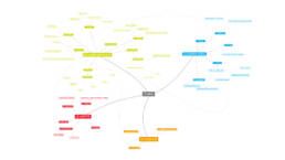
To clarify our thinking we began by mind-mapping the entire organisational scope. This allowed us to pre-empt usage, scale and colour pitfalls and plan accordingly. The naming required a balance between local culture, global comprehension and ability to withstand the test of time. The basis of the visual design cam about after long debates and exploration but ultimately coming back to the heart of art – subjectivity and point-of-view. Snippets of the process are shared below.
We covered all aspects of the identity from naming to purpose articulation & philosophy to corporate behaviour to the visual representation and its applications across all media.
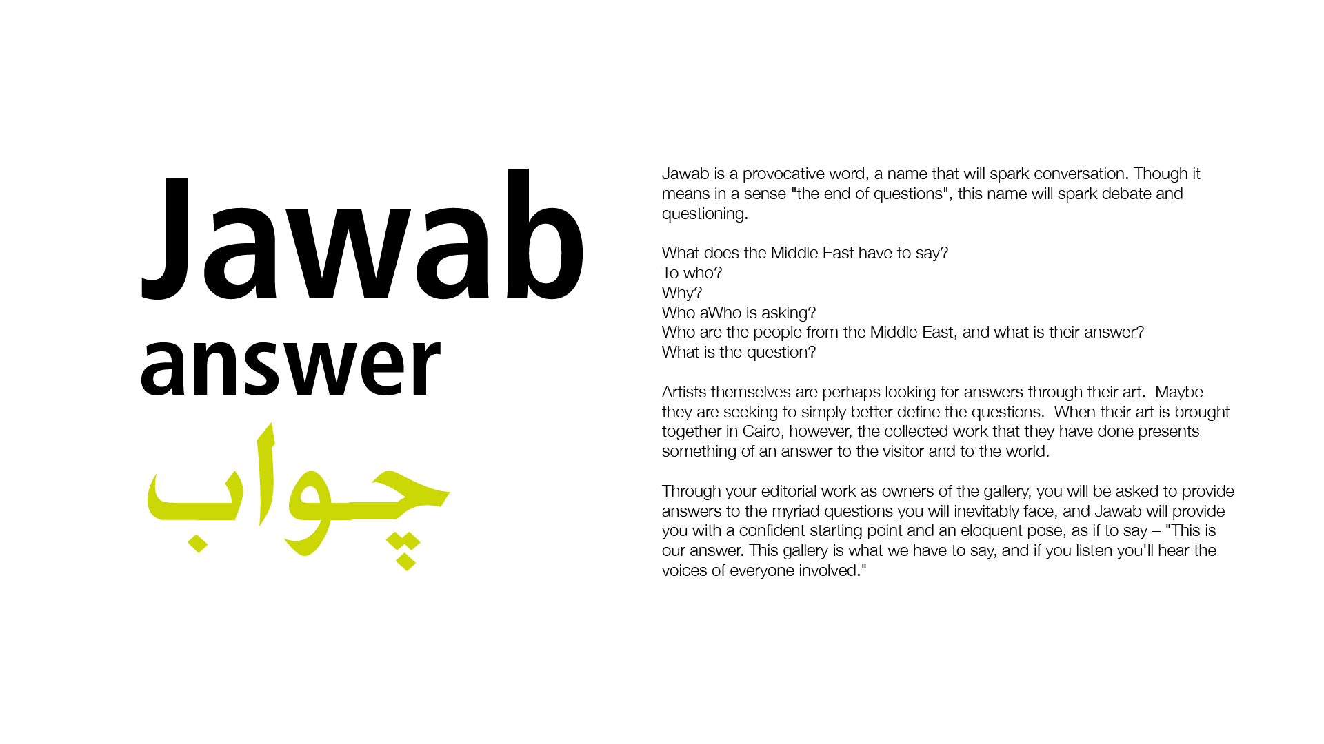
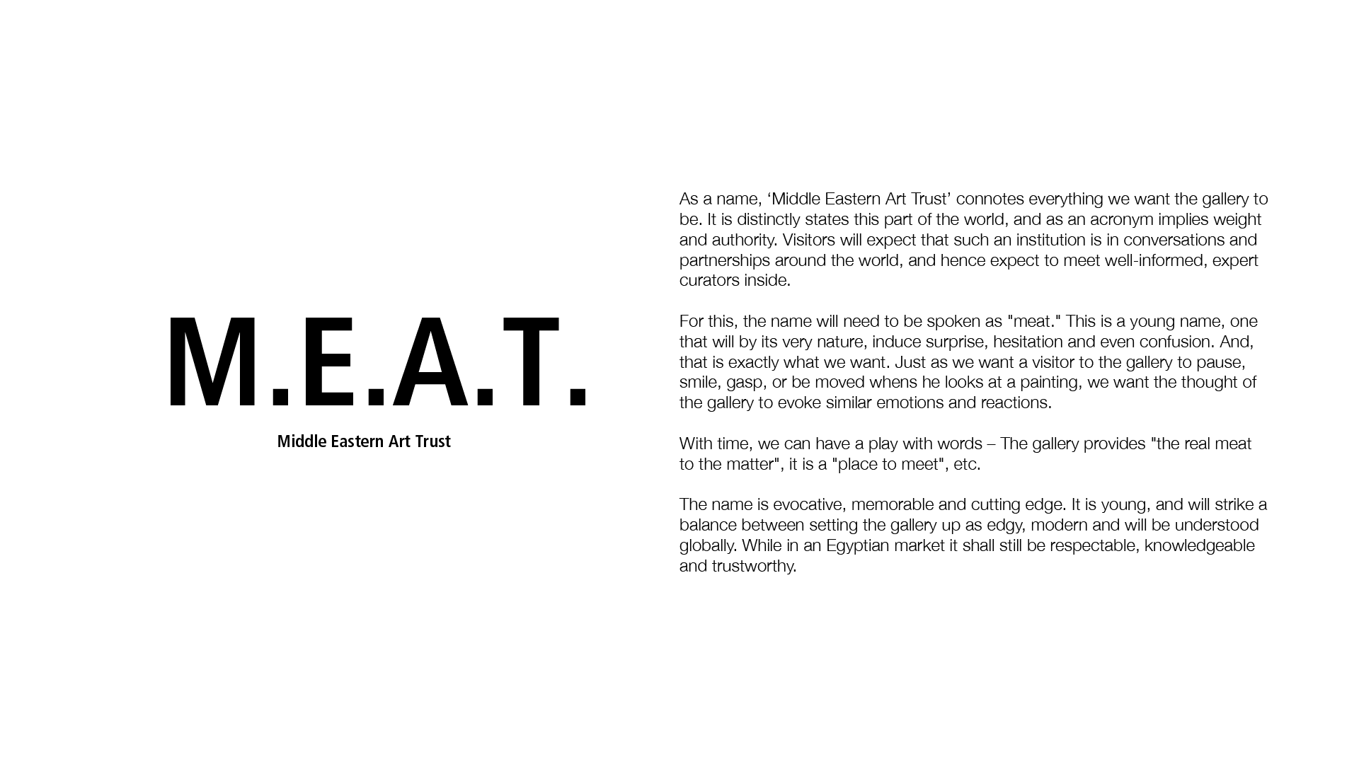
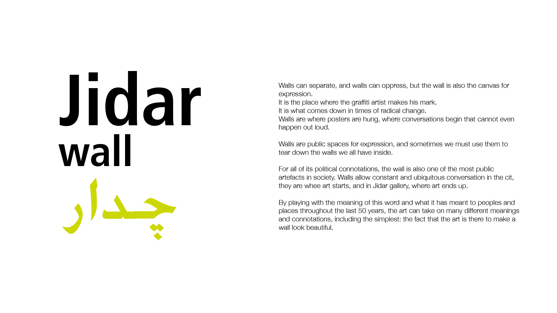
The Naming.
Purpose, Philosophy, Corporate Values & Goals Development.